Everyone wants to live somewhere safe, if they can help it. Using open data published by the National Police Agency and Kyushu's prefectural police, we've plotted over 100,000 traffic accidents (5 years) and over 80,000 crime incidents (7 years) across all of Kyushu, color-coded by type and switchable by year. Here's the story behind it, told frankly, plus a personal take on using maps to cut across the silos in public data.
Hello from the MAPRISE development team. This one's a slightly heavier topic than usual, so let's just be frank about it. We've mapped traffic accident and crime data across all of Kyushu.
Everyone wants to live somewhere safe
It's an obvious thing to say, but everyone wants to live somewhere with decent roads and decent public safety. Conversely, areas with high disaster risk or a reputation for being unsafe tend to have lower land prices. Can we back up that "everyone knows this" intuition with actual data? That's where this layer started.
What we added
We pulled in 5 years of traffic accident data (2019-2023) from the National Police Agency's traffic accident statistics open data — 108,538 records. The source data already carries latitude/longitude in degrees-minutes-seconds format, which we converted to decimal and plotted on the map along with road-name information.
The second dataset is crime incident data covering all 7 Kyushu prefectures — 80,250 records (fiscal years 2018-2024), based on open data published by each prefectural police department and municipality.
Traffic accidents are pinpoint. Crime incidents are chome-level.
These two datasets differ in precision, and we want to be upfront about that.
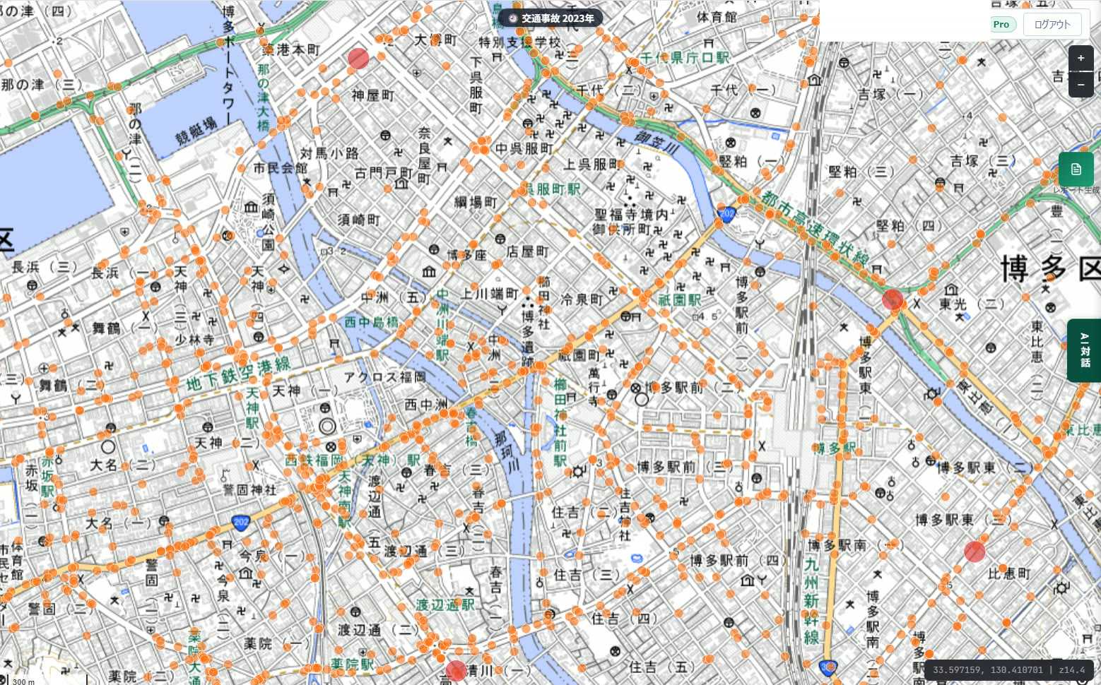
Traffic accident data comes with the actual incident coordinates built into the National Police Agency's statistics, so we can plot the exact intersection where an accident occurred. "Wait, this intersection has way more accidents than I'd have guessed" is the kind of thing you can actually spot directly.
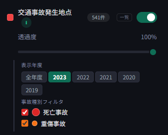
Fatal accidents show as larger, darker red dots; serious-injury accidents as orange dots. You can filter to a specific year or view all years combined.
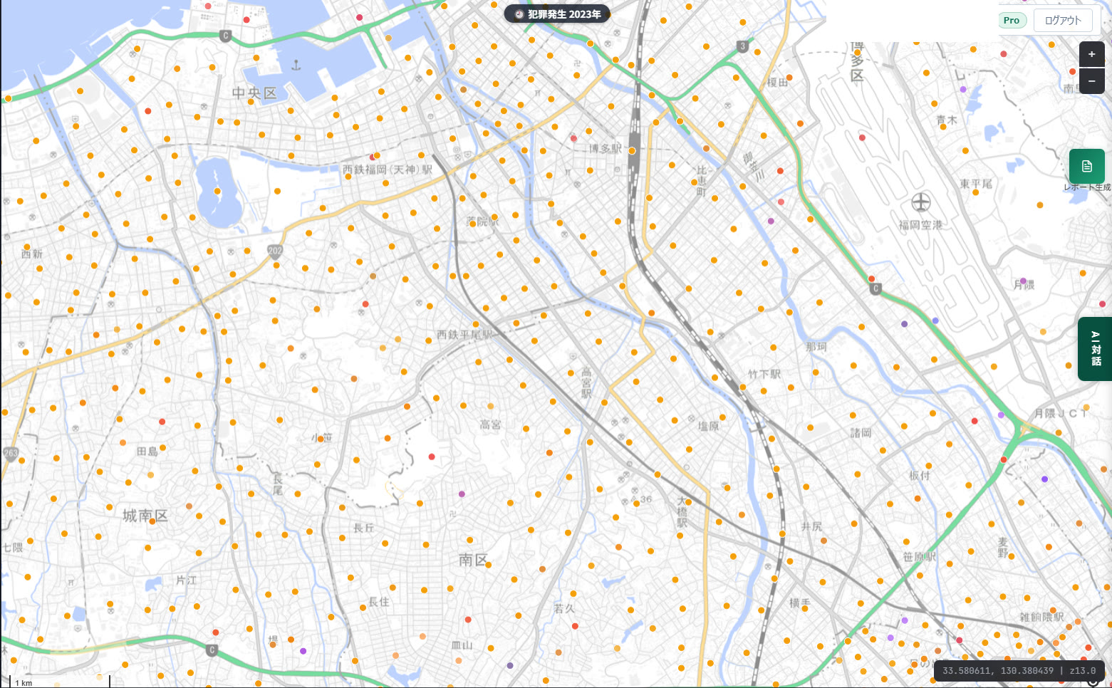
Crime incident data is different. The source data only records addresses down to the municipality and chome (town-block) level — no street number. So MAPRISE geocodes each incident to the representative point of that chome. In other words, a pin on the map means "this kind of incident occurred somewhere in this chome" — it does not point to the specific building or exact spot where it happened. We want to be clear about that distinction so nobody reads more precision into it than is actually there.
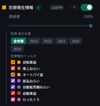
Crime types are color-coded by method — bicycle theft, theft from a parked vehicle, motorcycle theft, theft of vehicle parts, theft from vending machines, vehicle theft, purse-snatching, and more. As with traffic accidents, you can filter by year or view every year at once.
Ask the AI, "What's this area's public safety like?"
You don't have to eyeball the dots yourself — you can also just ask the AI chat. Ask something like "what's the safety situation around this location?" and the AI tallies crime counts and types, plus accident counts and casualty figures, for the area you specify, and answers in plain sentences. Getting a quantitative count alongside a qualitative explanation is exactly the kind of thing conversational AI is good for. The property report PDF also includes a section summarizing nearby crime density and accident trends.
Different value for different industries
Real-estate agents can use nearby crime and accident trends as material when explaining an area to a client. Developers can use area-wide safety and accident trends during early-stage site selection. Licensed professionals (appraisal, survey work) can use it as primary-source input for area history and environmental surveys. Financial institutions can factor it into a broader risk assessment of a collateral area. Municipal staff working on urban planning and disaster prevention can use it as baseline material for deciding where to concentrate countermeasures.
The value doesn't change for an individual using the map, either. Whether you're looking at where you might move, or the neighborhood you already live in, seeing what accidents and incidents have actually occurred nearby can sharpen your everyday awareness and your sense of what to prepare for.
Cutting across administrative silos, on a map
Let me get a bit personal here. Government agencies get criticized a lot for being siloed. But I don't think that's unique to government — the bigger an organization gets, and the heavier the responsibility a given department carries, the more it naturally tends toward silos. Clarifying scope of responsibility and deepening expertise pushes things that way almost by structural necessity. In a sense, it's the byproduct of healthy organizational design, not a failure of it.
Even so, when the National Police Agency's data, the Ministry of Land, Infrastructure, Transport and Tourism's data, and each municipality's data are all published separately, in their own silos, it's genuinely hard for any one resident to build a complete picture of their own neighborhood. MAPRISE is just one small private company, but I believe this kind of cross-cutting work — connecting data across those silos — is something we can actually do, complex and difficult as it is. Layering it all on one map. Letting people ask the AI anything about it. That ease of use is exactly the kind of value a small team like ours can offer.
"Data democratization" has been a buzzword for a while now, but to me, it only really counts as democratization once anyone can easily understand the data and actually put it to use in their own decisions. A map is a natural format for representing this kind of spatial data. Holding vast quantities of quantitative data in a database, and being able to pull up exactly what you need in a matter of seconds — that's what we consider MAPRISE's real strength.
We'll keep quietly adding more of these cross-silo overlays going forward.
The traffic accident data in this article comes from the National Police Agency's traffic accident statistics open data. Crime incident data comes from open data published by each Kyushu prefectural police department and municipality. Crime incident locations are geocoded representative points at the town-block (chome) level and do not indicate the precise location where an incident occurred. For public safety and disaster-preparedness decisions, please also check the latest official information and local sources.
Tags: #Traffic accidents #Crime data #Public safety #Open data #Data democratization
Other-language share text (exception cases)
Quick share above follows our platform-locked language policy (X-family in Japanese, LinkedIn in English). The four panes below let you grab the opposite-language body when needed — e.g. introducing an English post to a Japanese audience on X, or posting a Japanese article to LinkedIn in Japanese. Each pane offers both a copy button and a direct intent link.
📝 その交差点、実は"事故多発地点"かもしれません ― 交通事故・犯罪発生データを地図に落とし込みました
誰しも、できれば安全な場所に住みたいものです。警察庁・各県警が公開するオープンデータをもとに、九州全域の交通事故(10万件超・5年分)と犯罪発生(8万件超・7年分)を地図上にプロットし、種別ごとに色分け、年度別に切り替えて見られるレイヤーを追加しました。開発の裏側と、行政の縦割りを地図で横串にしたいという個人的な思いをフランクに書きます。
https://maprise.jp/ja/blog/crime-traffic-accident-layers/ #交通事故 #犯罪発生
🆕 新しいブログ記事を公開しました。

《その交差点、実は"事故多発地点"かもしれません ― 交通事故・犯罪発生データを地図に落とし込みました》

誰しも、できれば安全な場所に住みたいものです。警察庁・各県警が公開するオープンデータをもとに、九州全域の交通事故(10万件超・5年分)と犯罪発生(8万件超・7年分)を地図上にプロットし、種別ごとに色分け、年度別に切り替えて見られるレイヤーを追加しました。開発の裏側と、行政の縦割りを地図で横串にしたいという個人的な思いをフランクに書きます。

👉 詳しくはこちら: https://maprise.jp/ja/blog/crime-traffic-accident-layers/
📝 That intersection might actually be an accident hotspot - we mapped traffic accident and crime data
Everyone wants to live somewhere safe, if they can help it. Using open data published by the National Police Agency and …
https://maprise.jp/en/blog/crime-traffic-accident-layers/ #Trafficaccidents #Crimedata
🆕 New on the MAPRISE blog.

《That intersection might actually be an accident hotspot - we mapped traffic accident and crime data》

Everyone wants to live somewhere safe, if they can help it. Using open data published by the National Police Agency and Kyushu's prefectural police, we've plotted over 100,000 traffic accidents (5 years) and over 80,000 crime incidents (7 years) across all of Kyushu, color-coded by type and switchable by year. Here's the story behind it, told frankly, plus a personal take on using maps to cut across the silos in public data.

👉 Read the full post: https://maprise.jp/en/blog/crime-traffic-accident-layers/

#Trafficaccidents #Crimedata #Publicsafety #Opendata #Datademocratization